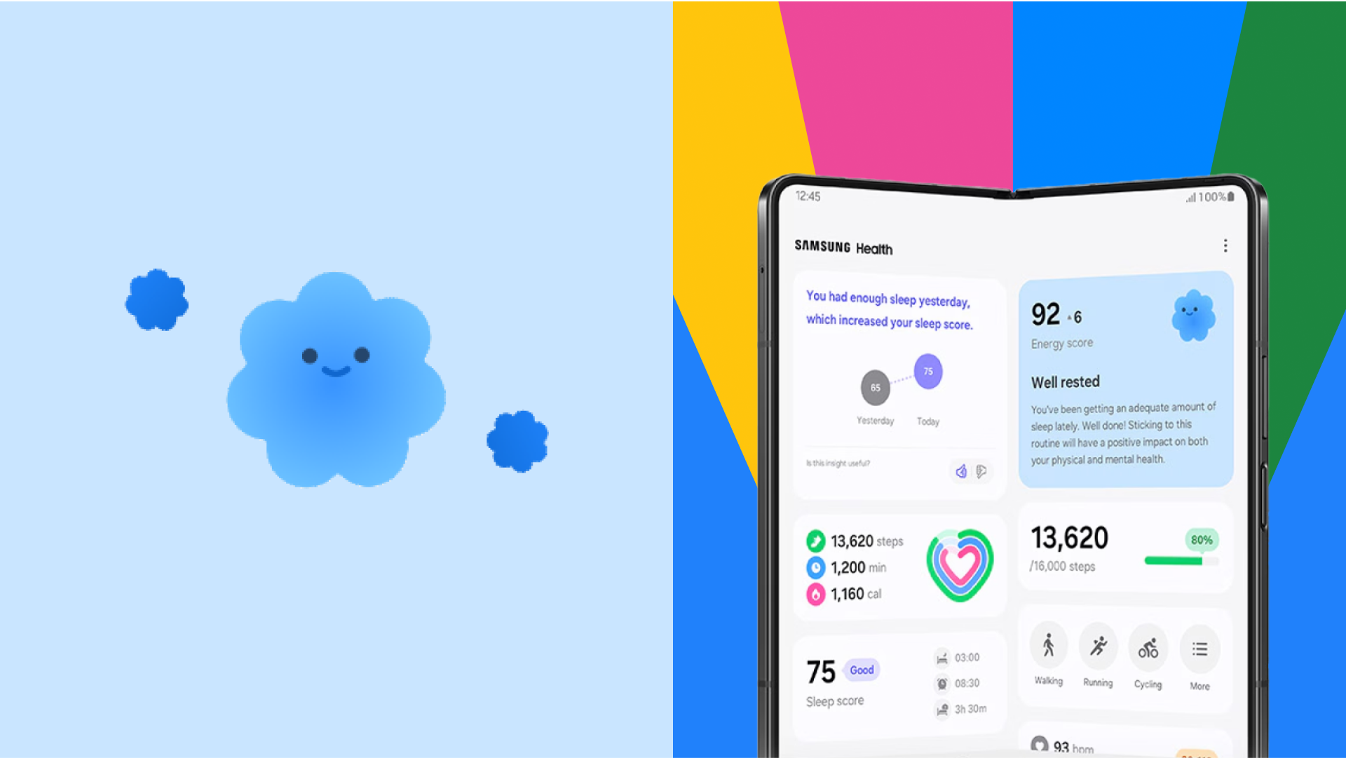
Case study: Samsung illustration system

```html
Visualizing Vitality: A Design System for Energy Scores
The Power of Shapes: Inspiring Healthier Habits
Imagine a visual language that speaks to everyone, regardless of background. That's the power of the Energy Score's character design. Using simple, universally understood shapes, these characters convey a spectrum of emotions with remarkable clarity and warmth. Even negative concepts are presented positively, encouraging users on their journey to better self-care.
Subtle animations breathe life into these expressive characters, emphasizing empathy and dynamism without overwhelming the user interface. Bold colors and a sense of progression make energy levels feel tangible, motivating engagement and a healthier lifestyle.
From Microscopic to Macroscopic: Illustrating Complex Concepts
From the intricate world of red blood cells to the broader concept of well-being, the Energy Score illustrations tackle a vast range of topics across fitness, medical health, sleep, nutrition, and mental balance. The challenge? Creating a flexible visual language that remains clear and accessible, regardless of complexity.
The solution is a two-tiered approach. A primary element conveys the core concept, while a secondary element enriches the narrative with metaphors and supporting details. These aren't mere decorations; they're informative tools, balancing clarity with an approachable warmth.
Cohesion is maintained across this diverse range of subjects through recurring elements, compiled into a comprehensive visual library. Dynamic, often slightly off-balance layouts, inject a sense of motion and energy even into static illustrations.
Inclusivity and Impact: Style and Accessibility
Representing the human form in an inclusive way is paramount. Stylized silhouettes and semi-transparent gradients achieve this, ensuring everyone feels represented. The flat, high-contrast color palette delivers strong visual impact and readability across various contexts.
Abstract details add dynamism and emotion, while gradients enhance depth and physicality. The result is a compelling blend of didactic and metaphorical elements, making complex ideas instantly intuitive. This innovative design system transforms how we understand and engage with our own well-being.
Creative Team
This innovative project is brought to you by: Creative Direction: Cristina Pasquale & Ilenia Notarangelo; Executive Production: Ani Karamanukyan; Illustration Lead: Sofia Buti; Illustration: Alessandra Marin, Michele Giamello, Silvia Sguotti & Arianna Cristiano; Animation: David Cubitt & Fabio Orlando; Producer: Daniel Ceballos; Portfolio Case Study: Giovanna Crise.